Archives for posts with tag: assessment
Self Portrait of Elfriede Lohse Wachtler, 1930. picture from : http://en.wikipedia.org/wiki/File:ELW-Selbstportrait.jpg

Self Portrait of Elfriede Lohse Wachtler, 1930. picture from : http://en.wikipedia.org/wiki/File:ELW-Selbstportrait.jpg

In my summer project I came across the Nazi’s policy on the arts. Kathe Kollwitz was forced out of her job at the Prussian Academy. Kollwitz was one of many, Expressionists and Modernists alike, who were targeted by the Nazi party for various reasons, their work was un – German, degenerate, they were communists or Jewish or the Nazi’s simply didn’t like their work. Hitler in his youth had applied to art school in Vienna, he was rejected. Some historians believe that this was a key point in his hatred of Modernism and also Hitler of course blamed all the Jews and Communists in Vienna art school for his rejection as he associated them with what he labelled as degenerate art. This evolved into the Degenerate art show or Entartete Kunst. Many great artists were put in the show and were terribly affected by the Nazi’s policy on the arts. Paul Klee, Max Beckmann and Otto Dix like Kollwitz all lost their positions at the Academies they worked for. Unlike Kollwitz they were forced or decided to leave Germany. Others like Ernst Ludwig Kirchner committed suicide after their work was removed from public exhibition. There is a whole lost generation of artists and artwork from this period. Not only was artwork banned and destroyed, but some artists were banned from painting and buying art materials. Artists were destroyed. I came across a female artist by the name of Elfriede Lohse Wachtler, who had her artwork banned and destroyed, she had several mental breakdowns because of this. She was put in a psychiatric hospital where is continued to paint but in 1935 she was forcibly sterilised under Nazi legislation and in 1940 she was murdered as part of the forced euthanasia program. With Entartete Kunst and the other policies the Nazi’s sought to first embarrass and ridicule the artists they deemed inferior then scrub them from history. We are still finding hordes of lost artwork and rediscovering artists like Wachtler who were so totally suppressed by the regime. A question that arose in the discussion after the lecture on this topic, was what would you do in this situation, would you flee or stay. Or if asked, like many were including Hugo Boss and Leni Riefenstahl, would you have worked for the regime or would you refuse and face retribution. In this there are so many variables, do you view a job as a job, how much do you know about the party and there policies, is it worth it? Its easy in hindsight to say that you would say no. It’s not clear-cut, its such a difficult question to answer, I would hope that I would have had the knowledge of the situation to say no but what if you didn’t really know who the Nazi’s were apart that they were in charge and they were offering you a job, for a struggling artist why wouldn’t you take a job such as this. But again unless you were really there its impossible to know the full truth.

page from Marjane Satrapi's Persepolis, 2008. picture from : http://parrishlantern.blogspot.co.uk/2011/07/marjane-satrapi.html

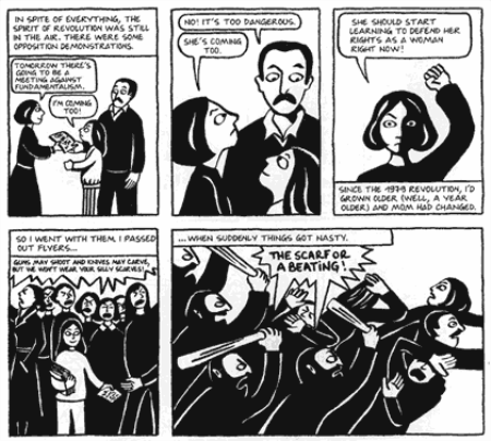
page from Marjane Satrapi’s Persepolis, 2008. picture from : http://parrishlantern.blogspot.co.uk/2011/07/marjane-satrapi.html

I want to move on and discus contemporary examples of artists who have lived similar political unrest and destruction. Marjane Satrapi, the author of Persepolis and Embroideries, is to my mind one such artist and shares comparisons with Kathe Kollwitz. Both came from a modern middle class family for their times. Their families supported and nurtured a variety of religious and political beliefs among them a support of the political left. Satrapi and Kollwitz both faced prejudice because of their sex. This is very apparent in Satrapi’s autobiography Persepolis as she was forced to wear the veil after Iran’s revolution led to Muslim fundamentalists taking control. Even in their work there is a similar raw feel to it and the use of black and white imagery. Both faced danger and intimidation from their governments. I love Satrapi’s work, the illustrations are simple maybe even crude but they portray such emotion that I find them echoing the raw expressiveness of Kollwitz’s woodcuts. Kollwitz remained in Germany during the war, I wonder what kept her there, her husband was dead and she had to leave her studios. Maybe it was the fact that despite everything Germany was her home and she knew she was going to die. In her last works she shows herself reaching out to Death coming arms. She had contemplated her own mortality and depicted human mortality so often in her artwork its almost she had accepted this end. Satrapi left her home country because her parents feared for her safety. I cannot imagine what it must be like to have to flee your home country. Satrapi returned to Iran and studied art, she was and is very vocal in her political opinions. For example how can you successfully study life drawing if the model is swathed head to toe in unfitted black fabric. She questioned this while at University.

It would be naïve to think that art and design is now free to do and say what ever it wants. Its not, artists are still being imprisoned, and shut down ( for example Ai Weiwei). Yes, we has free speech but it takes a very strong and convicted person to standby their views in the face of a totalitarian regime. Saying that, those artists who left Germany were not and will never be cowards or less in any way. They were just as strong as those who stayed, they faced a whole new world and spread the legacy of movements like the Bauhaus and German Expressionism.

References and Links to webpages that helped me write this post :

BURNS, L. BBC article on Why Hitler Hated Modernism. Available at : http://www.bbc.co.uk/news/magazine-24819441

Wikipedia Degenerate Art. Available at : http://en.wikipedia.org/wiki/Degenerate_art

Wikipedia Degenerate Art Exhibition. Available at : http://en.wikipedia.org/wiki/Degenerate_Art_Exhibition

KUHNEL, A. Moma, Degenerate Art. Available at : http://www.moma.org/collection/theme.php?theme_id=10077

JONES, J. What the Nazi’s didn’t want you to see. Available at : http://www.theguardian.com/world/2005/aug/16/secondworldwar

All of the above links were accessed on the 29.11.2013.

Satrapi, M. (2006) Persepolis. London. Jonathon Cape.

Satrapi, M. (2008) Embroideries. London. Jonathon Cape.

Post Modernism started to creep in around the 1950’s, but I’m going to focus on the late 70’s/80’s as that’s what I associate Post Modernism. For Modernism and Ludwig Miles Van der Rohe “Less is more.” but for Robert Venturi and  Post Modernism “Less is a bore.” I disagree, less generally is better, but then again I’m not a great fan of the visual aesthetic of the 80’s. Warhol’s pop art prints are great when you first see them work and the Buzzcocks Orgasm Addict cover is really cool but it all becomes a little abrasive and garish after a while. I find a lot of 80’s design a little ugly, as the song say “It was acceptable in the 80’s”. Its just really not my cup of tea.

I quite like the above image, its quirky and made from parts of an Argos catalogue. I have a we chuckle when I see because its funny in its own subversive way. Post Modernism, rejected and recycled the old, it was avant garde but also the artistic style of the time. We had a two part lecture on Post Modernism. The second half being about commercialism, mass production and reproduction, which I feel sums up Post Modernism really well. Now I wasn’t around in the 80’s so my view is a little bit skewed by films, to me the 80’s was very much about money, sex, power, rebellion and punk.

On one side their were the rebellious anarchic punks with the likes of Vivienne Westwood and Malcolm Garret. I quite like punk but it is very hard to explain, sometimes it was just trying to be shocking for the sake of insulting people because why not it could. This was counterbalanced by brightly power dressed people talking on giant mobile phones. The 80’s and Post Modernism all just seems to be a little bit done in bad taste, at the time I’m sure it was less so or maybe it wasn’t. I have asked a primary source (my Mum) and she described the 80’s as an age of “visible consumption” in other words if people had money, they bought what was in vogue and made sure everyone could see. Yuppies and Sloane rangers, with giant shoulder pads, a soda stream and the whole family watching E.T and Gremlins.

In terms of design, I was rather irked by a David Carson quote, now I quite like some of Carson’s work, but this I don’t really get and I suppose its this aspect of Post Modernism that I just don’t get. Carson say “Don’t confuse legibility with communication.” Now that’s all fine and dandy for some things but, in a commercial sense what’s the point of having a poster promoting an event or exhibition that either nobody can read or that takes the average person like myself ten minutes to decipher. It can look as abstract and as conceptual and cool as it likes but if doesn’t get the message across before the viewer is either bored, confused or alienated. Post Modernism was new for the time, but its a bit like what happens when you let a three year old lose with coloured paints, its messy, it has some merit but it lacks control. They have all the tools but want to be different and not like what’s gone before but are still inspired by them. And what you get is a huge money spinning, commercial, multi – coloured Frankenstein’s monster that keeps popping up and trying to be cool again. This has happened recently in fashion. The 80’s and Post Modernism have a lot to answer for. They made bad taste kind of acceptable and fashionable and a thing so to speak in art, design, music and fashion. It sometimes leaves you wondering why and also feeling a little bit nauseated.

References and Links to webpages that helped me write this post :

“Less is More” Ludwig Miles Van der Rohe 1886 – 1969 :http://en.wikipedia.org/wiki/Ludwig_Mies_van_der_Rohe

“Less is a Bore”  Robert Venturi 1925 – ? Available at :http://en.wikipedia.org/wiki/Ludwig_Mies_van_der_Rohe

“It was acceptable in the 80’s” from Acceptable in the 80’s by Calvin Harris 2009. Available at : http://artists.letssingit.com/calvin-harris-lyrics-acceptable-in-the-80s-2mxpk7h#axzz2lmaOMdU7

Acceptable in the 80’s by Calvin Harris. Available at : http://www.youtube.com/watch?v=dOV5WXISM24

“Don’t confuse legibility with communication” David Carson, 2007, Helvetica. Available at :  http://www.imdb.com/title/tt0847817/quotes

CATSPARELLA. 80 totally awesome things from the 80’s. Available at : http://www.buzzfeed.com/catsparella/80-totally-awesome-things-from-the-80s-1ruv

Wikipedia Postmodernism. Available at :  http://en.wikipedia.org/wiki/Postmodernism

Wikipedia Postmodern. Available at : http://en.wikipedia.org/wiki/Postmodern_art

All of the above links were accessed on the 26.11.2013.

The last lecture of the semester was on expanded narrative, focusing on the Wolf through narrative history. From totems, to little red ridding hood, to a film clip that I really wish could be unseen. But instead of going down the interesting but disturbing route of the wolf, I have decided to explore the history of the figure of Santa Claus since it is coming round to that time of year again. Santa Claus was originally the 4th century saint Nicholas from Turkey, who lived around the time of emperor Constantine. Who supposedly once slapped a bishop for saying that Jesus wasn’t holy enough.

I’m writing this as I watch Arthur Christmas, which is about Santa Claus in the 21st Century. I’m from the UK so my Santa Claus tradition is that Santa comes on Christmas eve ( the 24th of December) and delivers presents to good children and coal to the bad. We leave out either beer or whiskey, a mince pie and carrots for his reindeer. And Santa is dressed in a red and white suit and hats with black boots and belt.

A classic Glendinning Christmas tree.

A classic Glendinning Christmas tree.

However not only is the jolly old fellow not the same in every country but the gift giving figure is pre- Christian. Odin who did feature in the wolf lecture can be seen as a Santa figure. As he used to head the yuletide hunt on his eight legged horse Sleipnir. Odin gave gifts to those in need, much like St. Nicholas who is said to have helped those in need of money, such three sisters who didn’t have enough for a dowry and were about to be sold into prostitution. Odin gave bread and was the father god of the Norse gods.

http://en.wikipedia.org/wiki/Odin

Odin was a big figure in Norse folklore but was transformed from his pagan roots as Christianity spread though Europe. Santa has ridden goats and given naughty children sticks. And he doesn’t always give presents for Christmas. In some European countries the main St. Nick gift giving happens on December 6th on St. Nicholas’s day. With gifts on Christmas day being more to do with Jesus. Christmas and Santa now are just a huge amalgamation of many different Christian and pagan traditions and figures. Each country has its own variations.

St. Nicholas also has this shared function of gift giver/ donor and justice/ authority figure, which can still be seen in one of the more modern Christmas traditions of the shopping centre Santa. I recently listened to a Radio 4 feature called the “The Santa Tapes”, the Santa’s talk about their experiences and one of the reoccurring things is the fact that children confide in Santa and tell him everything from the mundane to the harder family or social issues. Now I don’t think I have ever visited a shopping centre Santa, I may have once sat on Santa’s lap at a Christmas party when I was little but I don’t think I ever told Santa what I wanted for Christmas. Through it may have had something to do with my younger sibling’s dislike of people in costumes. The idea of a strange man coming into the house every Christmas eve didn’t help this matter. Saying after it was explained that Santa was a benevolent character all was well. However just as my younger sibling got into the Christmas spirit and began to believe in Santa. I figured out that for the most part it was my parents giving me presents and doing my stocking, I think I was maybe five or six. I still entertained and liked the idea of Santa but I had ruined it for myself in part. I wish I had believed for longer and when watching Christmas films I find myself wishing it even harder. Because of Miracle on 34th Street I really wish Richard Attenborough was Santa, it and films like Elf and The Polar Express leave me with the overwhelming feeling that good, truth and the spirit of Christmas will and is triumphant. That is the feeling that those films set out to create and I’m a sucker for them. But just once a year its nice to get nostalgic about the belief you once had and not be cynical about the Christmas spending and the like. My parents are Christian so I quite like the religious aspect but also the fact that on Christmas there is a genuine spirit of goodwill that people make time for. And Santa Claus reinforces that, if one man, nine reindeer, and some elves can deliver a present to every good child in the world then it should hardly be a pinch to be extra nice around the Christmas period. Obviously you should try to be nice all year round but if Scrooge taught us anything Christmas is a time for hope and reconciliation and  couple of weeks later you can make a new years resolution.

Though Santa has become rather lost in commercialism. I’m not a fan of the Coca Cola Christmas, it never changes, I do appreciate the thought put into the Marks and Spencer’s and John Lewis adverts. The Marks and Spencer’s ad Christmas clothes ad : https://www.youtube.com/watch?v=O7Xw1IL3oh0 it references the wizard of Oz, Alice in Wonderland, Little Red Ridding who featured heavily in the Wolf lecture, Hansel and Gretel and Aladdin/ Arabian Nights. Fairy tales are in needless to say. And Santa Claus is one of the oldest folk characters if you take out the Christian element. Most story’s have a gift giving character who gives the hero a key item. This happened in the Lion, the witch and the Wardrobe where Santa gave our three (Edmund was off with the witch at this point) hero’s their weaponry, definitely not toys but it was what those good children needed.

It is rather sad that major mythological characters and fairy-tale motifs have been used and abused so much commercially but it does show their enduring influence and relatability that such things have on society. I think its how narrative evolves in the modern age even if some of its charm and originality is lost. This happens to most things. Its kind of inevitable. Yet,  I think some small part of people want to believe in something good and just that comes at the end of a hard year. So Merry Christmas and a Happy Hogmanay to you all in this coming season of goodwill.

References and Links to webpages that helped me write this post :

Wikipedia Santa Claus. Available at : http://en.wikipedia.org/wiki/Santa_Claus

JENNER, G. A weird history and Christmas. Part two. Who on earth is Santa?!. Available at : http://www.huffingtonpost.co.uk/greg-jenner/santa-weird-history-of-xmas_b_2302854.html.

DEIN, A. The Santa Tapes. BBC radio 4. Available at : http://www.bbc.co.uk/programmes/b00pbrt6

All the above links were accessed on the 25.11.2013

Lewis ,C.S. (1950) The Lion, the Witch and the Wardrobe. Harper Collins Children’s Books.

Dickens, C. (2008) A Christmas Carol. Puffins Classics.

Note : I’m sorry if anyone has had problems with my blog loading or loading incorrectly. I’ve viewed my blog on a mac and a pc and the only issues I came across were the occasional image being squashed and some text escaping from photo text boxes. But everything was still readable. Fingers crossed 🙂

Dessau Bauhaus school. picture from :http://en.wikipedia.org/wiki/File:Bauhaus.JPG

Dessau Bauhaus school.
picture from :http://en.wikipedia.org/wiki/File:Bauhaus.JPG

I’m going to talk about the Bauhaus as it ties in quite nicely with my summer project. Though the Bauhaus’s relationship with German Expression is much disputed. I believe it must have had an undeniable influence on them as they were joined by Wassily Kandinsky a member of the Der Blaue Reiter one of the two groups of German Expressionism. The Bauhaus was set up in 1919 by the architect Walter Gropius in Weimar, Germany. It was the coming together of the Weimar Academy of Arts and the Weimar School of Arts and Crafts. This joining of the fine arts and the applied arts was much inspired by William Morris’s Arts and Crafts movement with wanted to combine and reinforce the importance of both form and function in art and design. Gropius would be joined by artists and designers such as Oskar Schlemmer, Paul Klee, Wassily Kandinsky, Johannes Itten, Lyonel Feininger, Gerhard Marcks and would have visits form the De Stijl arstist Theo Van Doesburg and Constructivist artist and architect El Lissitzky. Gropius would be followed by Hannes Meyer in 1928 and Meyer would be followed by Ludwig Mies Van Der Rohe in 1930 as heads of the Bauhaus. Despite only running for 14 years.

On White II by Wassily Kandinsky 1923. picture from :http://en.wikipedia.org/wiki/File:Kandinsky_white.jpg

On White II by Wassily Kandinsky 1923. picture from :http://en.wikipedia.org/wiki/File:Kandinsky_white.jpg

The Bauhaus’s influence spread widely throughout the western world due to the fact that many of its members emigrated after its forced closure in 1933 by the Nazis. The Nazis presence and disapproval of the Bauhaus and its ideas was felt very early on its short flourishing. Weimar had been and ideal situation for the Bauhaus as, it was where Germany’s new democracy was laid out, hence the Weimar republic, and the state government of Thuringia (where Weimar was situated) was until 1924 held by the social democrats. But in 1924 the NSDAP (Nazi party)  gained control of the Thuringia state government and promptly but the staff of the Bauhaus on six month contracts and cut their funding in half. This caused the Bauhaus’s move to Dessau, more problems arose as the school fought not to labelled as a hot-house of the Bolshevism that the right feared so greatly. Though Hannes Meyer the new head of the Bauhaus at this point was slightly more towards the left, he didn’t want the school to become politicised. As support for the NSDAP grew, it spread to Dessau prompting the schools move to Berlin where they remained for  their last ten months before closing in 1933. The Bauhaus was labelled as Degenerate Art and  ‘un – German’ for all its Communist and Jewish ties. Yet despite it short life, Bauhaus is still influential today.

Staatliches Bauhaus Weimar 1919 - 1923 by Herbert Bayers. picture from :http://www.metmuseum.org/toah/works-of-art/2001.392

Staatliches Bauhaus Weimar 1919 – 1923 by Herbert Bayers. picture from :http://www.metmuseum.org/toah/works-of-art/2001.392

Red/Green Architecture , yellow/violet gradation by Paul Klee, 1922. picture from :http://en.wikipedia.org/wiki/File:Red_Green_Architecture_yellow_violet_gradation_by_Paul_Klee.jpeg

Red/Green Architecture , yellow/violet gradation by Paul Klee, 1922. picture from :http://en.wikipedia.org/wiki/File:Red_Green_Architecture_yellow_violet_gradation_by_Paul_Klee.jpeg

Its influence on modernist architecture was great but so was its art and its experimentation in typography and colour theory. Herbert Bayers and Laszlo Moholy Nagy did much work with experimental typography it. Bold text laid out in geometric formats was a big departure from the norm. It may not have always be successful in that it was not always functional. In that it was hard to read but it made and still makes an impact on the viewer. Colour theory was also important to the artists of the Bauhaus, Itten, Feininger and Kandinsky can be seen as examples of this. They are described as Expressionists but they sought to find a scientific theory behind the use and the feel of colours and shapes and there relationships. You can take a Kandinsky colour test here :

http://www.moma.org/interactives/exhibitions/2009/bauhaus/Main.html

Farbkreis by Johannes Itten. picture from :http://en.wikipedia.org/wiki/File:Farbkreis_Itten_1961.png

Farbkreis by Johannes Itten. picture from :http://en.wikipedia.org/wiki/File:Farbkreis_Itten_1961.png

The Bauhaus aim was to do what Morris had attempted all those years ago to create a “new guild of craftsmen, without class snobbery.”  Walter Gropius, Bauhaus pamphlet, 1919. Germany was a new country of sorts with new ideas and had been greatly changed by WWI and was still recovering from its effects. The Bauhaus ‘s modernism wanted to bring together art and design, form and function in order to better both fields and so that they could learn from each-other. The Bauhaus system is what most contemporary art colleges have been modelled. That is a pretty good legacy for such a short-lived movement that faced so much adversity.

References and Links to webpages that helped me write this post :

WINTON, A, G. The Bauhaus 1919 – 1933. Available at :http://www.metmuseum.org/toah/hd/bauh/hd_bauh.htm

Encyclopaedia Britannica, Bauhaus. Available at :  http://www.britannica.com/EBchecked/topic/56418/Bauhaus

MOMA. Bauhaus 1919 – 1933. Available at : http://www.moma.org/interactives/exhibitions/2009/bauhaus/Main.html

Bauhaus online. Walter Gropius Bio. Available at : http://bauhaus-online.de/en/atlas/personen/walter-gropius

Bauhaus Online. Available at : http://bauhaus-online.de/en

“new guild of craftsmen, without class snobbery.”  Walter Gropius, Bauhaus pamphlet, 1919 from : http://en.wikipedia.org/wiki/Bauhaus

All of the above links were accessed on the 21.11.13.

A study in red chalk by Raphael for the Three Graces, 1518. picture from : http://en.wikipedia.org/wiki/File:Raffaello,_studio_per_le_tre_grazie_della_farnesina.jpg This was not the PRB's cup of tea at all.

A study in red chalk by Raphael for the Three Graces, 1518. picture from : http://en.wikipedia.org/wiki/File:Raffaello,_studio_per_le_tre_grazie_della_farnesina.jpg
This was not the PRB’s cup of tea at all.

This lecture began with the work of Renaissance artists such as Da Vinci, Raphael and Durer. But went on to go through many artistic movements bringing us up to Modernism. Which will be tackled in some form along with Post – Modernism in my next post. I decided to do a post on the Pre – Raphaelite Brotherhood, which was founded in 1848 by William Holman Hunt, John Everett Millais and Dante Gabriel Rossetti. There was four other members, William Michael Rossetti, James Collinson, Fredric George Stephens and Thomas Woolner. But I am going to focus on Hunt, Rossetti and Millais. The Pre – Raphaelite Brotherhood or PRB’s work was viewed sometimes very harshly by critics (among them Charles Dickens) and the Royal Academy. The PRB rejected the work of Raphael and other Renaissance artists, hence the name, and sought as they put it in the manifesto to :

  • “to have genuine ideas to express
  • to study nature attentively, so as to know how to express them
  • to sympathise with what is direct and serious and heartfelt in previous art, to the exclusion of what is conventional and self-parodying and learned by rote
  • most indispensable of all, to produce thoroughly good pictures and statues “

Pre – Raphaelite Brotherhoods manifesto, 1848, from : http://en.wikipedia.org/wiki/Pre-Raphaelite_Brotherhood

The Scapegoat by William Holman Hunt 1856. picture from : http://en.wikipedia.org/wiki/File:William_Holman_Hunt_-_The_Scapegoat.jpg

The Scapegoat by William Holman Hunt 1856. picture from : http://en.wikipedia.org/wiki/File:William_Holman_Hunt_-_The_Scapegoat.jpg

The themes that all the painters shared were nature, medieval tales and religion. Hunt painted many religious works, especially after his trip to the Holy land. It was this trip that inspired the painting of “The Scapegoat” in 1856. Prior to this Hunt’s work had been very occupied with nature but still inspired by classic tales and characters such as the fallen woman. He became famous for his religious works whereas his paintings such as “The Hireling Shepard” and “Awakening Conscience” were regarded as inelegant and unsightly.  A great attention to detail can be noted in both the work of Hunt and of Millais.

Nature was very important to the PRB and possibly one of the most lush examples of nature can be found in Millais’s “Ophelia” 1852, which depicted the suicide of Ophelia in Shakespeare’s Hamlet. “Ophelia” is one of my favourite paintings, I think I saw it at a very young age and was captivated by the rich flora and the beauty of the model, Elizabeth Siddal, who modelled for the PRB and married Rossetti and was an artist herself. Millais was child prodigy and did gain the patronage of critic John Ruskin. Though this did not last due falling in love with Ruskins wife of five years Effie Ruskin whom was still a virgin. But that’s a story for another day.

Love, sexuality and symbolism was another key theme for PRB, especially Dante Gabriel Rossetti. I find Rossetti’s style quite different from the other members of the brotherhood, Millais in particular whose style is very classical. Rossetti style feels to me to be a precursor of sorts to Art Nouveau. I think its his reoccurring use of beautiful, goddess like women. Of which their were quite a few and many whom he had relationships with. There was Elizabeth Siddal whom he met in 1850 and married in 1860 but she died two years later from a laudanum overdose. Siddal was famous for her near death experience brought on by modelling for Millais’s “Ophelia”. Like most of Rossetti’s muses Siddal had brilliant copper hair and a pale complexion. Rossetti painted her as Beatrice from the story Dante and Beatrice.

Beata Beatrix by Dante Gabriel Rossetti 1867 - 1870. picture from : http://en.wikipedia.org/wiki/File:Dante_Gabriel_Rossetti_-_Beata_Beatrix,_1864-1870.jpg

Beata Beatrix by Dante Gabriel Rossetti 1867 – 1870. picture from : http://en.wikipedia.org/wiki/File:Dante_Gabriel_Rossetti_-_Beata_Beatrix,_1864-1870.jpg

http://fascinatinghistory.blogspot.co.uk/2006/01/dante-and-beatrice.html

Rossetti’s other models included Fanny Cornforth, Alexa Wilding, Marie Spartali Stillman, Annie Miller and Jane Morris. Jane Morris was the wife of William Morris the founder of the Arts and Crafts movement. The three were good friends but it could be described as something of a love triangle. Jane Morris shared the other models pale complexion but her hair was raven black. But like Siddal she was one of Rossetti’s great muses and beauties.

Proserpine by Dante Gabriel Rossetti 1874. picture from : http://en.wikipedia.org/wiki/File:Dante_Gabriel_Rossetti_-_Proserpine.JPG

Proserpine by Dante Gabriel Rossetti 1874. picture from : http://en.wikipedia.org/wiki/File:Dante_Gabriel_Rossetti_-_Proserpine.JPG

The Pre – Raphaelite Brotherhood were controversial, disliked and avant – garde for their time in the rather stuffy Victorian London. Their lives and loves have been fictionalised many times. Their work was beautiful, naturalistic, religious and for the time just a little bit naughty. The PRB pursued their own kind of realism that was just a tad inventive at times.

References and Links to webpages that helped me write this post :

The Tate gallery. Pre – Raphaelites : Victorian Avant – garde. Available at : http://www.tate.org.uk/whats-on/tate-britain/exhibition/pre-raphaelites-victorian-avant-garde

BBC news article on the selling of Rossetti’s Proserpine. Available at : http://www.bbc.co.uk/news/entertainment-arts-25004793

MASTERS, T. Lizzie Siddal: Victorian model’s tragic story on stage. Available at :  http://www.bbc.co.uk/news/entertainment-arts-24803177

Desperate Romantics programme page. Available at : http://www.bbc.co.uk/programmes/b00lvyq2

Wikipedia. The Pre – Raphaelite Brotherhood. Available at : http://en.wikipedia.org/wiki/Pre-Raphaelite_Brotherhood

All of the above links were accessed on the 20.11.2013.

One of the things that interested me from the narrative lecture was the work of Vladimir Propp. I have always enjoyed folk and fairy tales. So my interest was piqued at the mention of an analysis of the narrative structure of Russian folktale. Propp was a Russian critic who in 1920 decided to study the components that made up Russian folktales. Character that remained constant were the hero, the villain, the donor, the dispatcher, the false hero, the helper, the princess and the princesses father. And between these characters certain situations always occur and are key to the plot such as the struggle between hero and villain followed by the villain being overcome and the hero being recognised and rewarded with a kingdom and/or a princess. And a happily ever after but often a moral lesson is also learnt.

One of Pienkowski's silhouette fairy tale illustrations. picture from : http://www.theguardian.com/books/gallery/2008/dec/19/booksforchildrenandteenagers#/?picture=340934959&index=4

One of Pienkowski’s silhouette fairy tale illustrations. picture from : http://www.theguardian.com/books/gallery/2008/dec/19/booksforchildrenandteenagers#/?picture=340934959&index=4

Two of my favourite folktales books are “The Amber Mountain and other folk tales” by Agnes Szudek, illustrated by Jan Pienkowski, who is better known for his work with Helen Nicoll on children’s favourite Meg and Mog, and “The Wise Doll” by Hiawyn Oram and illustrated by Ruth Brown. The former being a collection of folktales from Poland, Slovakia, the Czech Republic, Lithuania and Germany.  Some the story’s are familiar as they have been retold such as ” The Amber Mountain”. You may also know this story as “The Seven Brother” or “The Six Swans” or “The Twelve Wild Ducks” or “Udea and her Seven Brothers” or “The Wild Swans” or “The Twelve Brothers”. At the core its a story about a daughter trying to save her brothers of varying numbers.

Illustration for The Swan princes by Anne Anderson. picture from : http://en.wikipedia.org/wiki/File:The_Swan_Princes_-_Anne_Anderson.jpg

Illustration for The Swan princes by Anne Anderson. picture from : http://en.wikipedia.org/wiki/File:The_Swan_Princes_-_Anne_Anderson.jpg

Some versions include the sewing of shirts, seven years of silence, infanticide by jealous Queen mothers, two daughters named Rosy red and Snow white who sound very familiar, cannibals, various forms of execution, treacherous aunts, moon people, princesses, peasant girls and evil flying toe nails. Some are rather gruesome, with beheadings, burnings, disfigurements and quite a bit of blood-letting and blood smearing. I think the original fairy tales that are a little bit more grisly have more merit that the watered down versions that are told to children now. Even the big bad wolf doesn’t die in little red ridding hood anymore. Some hero’s have to kill their villain, in cinema and literature we are returning to dark fairy tales. For example I was never a big superman fan, I’d only seen the squeaky clean ‘kid’ version so was adamant about seeing the Man of Steel reboot. I was pleasantly surprised but the death of the antagonist was very violent and emotionally fraught. Superman (the hero) doesn’t want to kill Zod (the villain) but he has no other choice. Something as permanent as a death of a character in a story line should be a resolution of the conflict and disorder but also define the hero’s morality. One example where I felt robbed of this resolution was in Thor: the Dark World. SPOILER ALERT do not read if you don’t want to know what happens at the end, concerning Loki and Thor, look away now.

So Loki dies, but he has redeemed himself and aided his brother and has been honourable. And though this was sad, the upset relationship that Thor and Loki shared through the first film and the Avengers movie was finally at rest. But no,  the joy of the money spinning franchise that is the Marvel superhero movies the last two seconds of the film and the story were ruined for me at least. For once Thor has told his Father of Loki’s redemption and Thor leaves to be with his mortal love. Odin shape shifts into a smirking Loki. I am sure Vladimir Propp would not approve or would he? Do characters like Loki inhabit both the villain and false hero role. Though it feels very much like Marvel money grabbing for more films because people will pay to see Tom Hiddleston as Loki the lovable and hateable trickster of Norse mythology.

The Wise Doll by Hiawyn Oram and Ruth Brown. picture from : http://www.publishersweekly.com/978-0-525-45947-7

The Wise Doll by Hiawyn Oram and Ruth Brown.
picture from : http://www.publishersweekly.com/978-0-525-45947-7

But I digress. My other book is “The Wise Doll” by Hiawyn Oram and illustrated by Ruth Brown. It a retelling of the Vasilia the Beautiful. Which included the Baba Yaga, who is a key character in many a tale. This retelling is very much for younger audience so emits some of the original stories more complex aspects but is still very gruesome and scary in places. One particular illustration of Baba Yaga her eyes glowing orange like hot coals still freaks me out, this book used to really scare me when I was younger. But I still wanted it read to me and I still read it. Baba Yaga is a villain and a tester of people. That’s what she’s there for, a good scare the book tells us. Sometimes we need to be scared. Like hiding behind the couch from the monsters on doctor who, or fearing that certain page in the children’s book where you really see the villain for the first time.

Illustration from Vasilisa the Beautiful by Ivan Bilibin. picture from: http://en.wikipedia.org/wiki/File:Vasilisa.jpg

Illustration from Vasilisa the Beautiful by Ivan Bilibin. picture from: http://en.wikipedia.org/wiki/File:Vasilisa.jpg

Fairy tales will always be retold, whether it be in cinema with superhero’s, or in children’s books with classic tales. They will or they should retain the key points that Propp analysed and if the don’t do they still have any constructive effect on us. As they say the moral of the story is that fairy tales are ingrained in our minds and our society and if they are tainted where does that leave us. Manically holding on to a wish of a sugar sweet happy ending or the complete opposite, humbugging our way though life without any belief or want of redemption.

Also just to point out I did really enjoy the second Thor movie, it was far better than the first and Tom Hiddleston is great as Loki. Just wish Marvel would, and this goes for many other comic book/ superhero franchises, would just let some characters die… permanently.

References and Links to webpages that helped me write this post :

Here is a link to a vimeo video of somebody ready “The Wise Doll” :http://vimeo.com/10822274

Szudek, A. (1976) The Amber Mountain, and Other Stories. Hutchinson.

Oram, H. (1997) The Wise Doll. Andersen Press Ltd.

All of the above links were accessed on the 19.11.2013.

There has always been something fantastical about animation to me. The word animation comes from the Latin Anima which translates as the breath of life. Animation is associated with energy, exuberance and liveliness. It is described technically as being a photographic technique in which successive 2D or 3D forms are captured and played back to create a moving image. Animated images have fascinated and beguiled man since the technique was created. The earliest known animation is not the thaumatrope or the zoetrope. It is believed that the earliest known animations can be found earthenware and ceramics from Greece and Iran. The thaumatrope, which became a popular Victorian toy,  was invented in 1825 by Dr John Paris.

The thaumatrope worked due to persistence of vision. A card with for example a flower one side and vase on the other would have two pieces of string or elastic attached to either end which could be wound and when released cause the card to spin. when looked at whilst spinning, the human eye sees the first image, holds it and before it can release this image, the second enters its vision thus merging the images. A flip book works in the same way but with more images just like any piece of animation.

zoetrope1

“Bouncing Totoro” 3D zoetrope by Studio Ghibli from : http://www.ghibliworld.com/museumspecial.html

One of my favourite things featured in the moving image lecture was the Studio Ghibli 3D Zoetrope. It features one of the most beloved Ghibli characters, Totoro. The “Bouncing Totoro” Zoetrope was made using 347 3D figurines and it took a year to complete. The 3D Zoetrope is a predecessor of William Horner’s Zoetrope. The fundamentals of drawn and 3D figurine animation have not changed greatly. It is the technology and the craft of animation that has evolved. Early lightning sketches animations didn’t have the realism that exists in modern animation.

Link to J. Stuart Blackton’s “The Humorous Phases of Funny Faces: http://www.youtube.com/watch?v=8dRe85cNXwg

Disney is very well-known for this but earlier is the work of Eadweard Muybridge, who was a very interesting character, was a pioneer of moving image. Even if this only came about due to a bet about whether or not when a horse runs if at one point all its hooves leave the ground. It turned out to be true though some mocked Muybridge’s discovery, it was true he had photographic evidence and an animation to stun the public. Muybridge’s books which contain series of successive images of people and animals are still highly influential to this day. If a little bit naked in places. I love a good animated movie, I am a huge studio Ghibli and Disney fan. I think I may actually prefer to look at Ghibli than Disney. Mostly because I don’t think I have ever seen a Ghibli film that was not visually stunning whereas some of the Disney sequels are somewhat lacking in the lustre that the first films had. Which is usually the way of sequels but it’s also rather disappointing. For example Mulan which had both a great plot and was visually stunning is rather let down by its sequel which doesn’t have the impeccable background and character art that the first movie had. Whereas Ghibli is just so lush. The scene in Spirited Away where Chihiro is running to the pig sheds through the flower bushes ( which I’m pretty sure are rhododendrons) is so vivid and so real, you really are pulled into that world. Like with a good book, a good animation draws you in and takes you into its world and a really good animation lingers in the memory. Persistence of vision.

References and Links to webpages that helped me write this post :

Muybridge, E. (2000) The Human Figure in Motion. Dover Publications Inc.

Eadweard Muybridge website. Available at : http://www.eadweardmuybridge.co.uk/

All of the above links were accessed on the 19.11.2013.

Cave painting of a bison is the Altamira caves in Spain - taken from : http://en.wikipedia.org/wiki/File:AltamiraBison.jpg

Cave painting of a bison is the Altamira caves in Spain – taken from : http://en.wikipedia.org/wiki/File:AltamiraBison.jpg

What is illustration? This was a question I asked myself when I started my summer project. For which I had to pick one artist or movement to research and write about. So I began with illuminated manuscripts which were featured in the Image lecture.

I began with the dictionary and the definition of illustration and illustrate : http://www.oxforddictionaries.com/definition/english/illustration?q=illustration Oxford dictionary definition. To illustrate comes from lustrare which means to illuminate thus leading me to illuminated manuscript. Most illuminated manuscripts were created predominantly in the Middle ages and laterally in the Renaissance. The word manuscript comes from the Latin for handwritten. which makes sense as illuminated manuscripts were handwritten over long periods of time by monks for the most part. If a manuscript was to be illustrated it would be sent to an illuminators. When moveable type and the print press came to the fore front want for the expensive and labour intensive manuscripts died out. Manuscripts like the Book of Kells and the Lindisfarne Gospels were written one vellum which was made of sheep or cow skins. So large manuscripts could use a herd of sheep to make.

Image of Christ from the Aberdeen Bestiary. Taken from :  http://en.wikipedia.org/wiki/File:AberdeenBestiaryFolio004vChristInMajesty.jpg

Image of Christ from the Aberdeen Bestiary. Taken from : http://en.wikipedia.org/wiki/File:AberdeenBestiaryFolio004vChristInMajesty.jpg

Here’s a wee link to a YouTube clip of a Horrible Histories episode that explained it better once it gets past monk sign language : https://www.youtube.com/watch?v=9wVTP2016G0

Illuminated manuscripts are viewed as one of the earliest examples of illustration however some argue that ” Art was illustrative long before it was holy” ( Illustration, A Visual History. Steven Heller and Seymour Chwast.  Abrams, New York, 2008) Therefore can cave paintings such as those at Lascaux and Altamira be viewed as illustration. Cave painting can be seen as man recording and illustrating the world around him albeit before text. I believe that cave painting can be viewed as illustration as it was integral to the visual mass communicative language of early man.

Now this lead me to the age-old question of what is the difference between fine art and illustration. In “Illustration, A  Visual History” by Steven Heller and Seymour Chwast, states that ” illustration is a clearly defined act of making art, the goal of which is to illuminate the printed page.” Illustration is not as some view it a lesser art in comparison to what is viewed as high or fine art. Illustration is art for the populace. It is a form of mass communication for a mass audience. There are many similarities between illustration today and the fine art of the Renaissance period. Whose artists, such as Durer used mass communicative processes such as printmaking to sell their artwork or to make it for themselves. There is no denying that illustration is sometimes very commercial but then again so is fine art. I feel that the idea at fine art is a higher art form is false and that it is almost impossible to completely separate fine art and illustration. They both have as much merit as each other.

References and Links to webpages that helped me write this post :

Oxford definition of fine art : http://www.oxforddictionaries.com/definition/english/fine-art?q=fine+art

Here is Illustration Art’s view on fine art and illustration : http://illustrationart.blogspot.co.uk/2011/10/old-question-finally-answered.html

Heller, S. Chwast, S. (2008) Illustration: A Visual History. New York. Abrams.

All of the above links were accessed on the 10.11.2013.

Printmaking - Mandorla

So I may have mentioned in one of my previous Kathe Kollwitz posts that I am starting my printmaking block in the studio. I’m doing lithography which I am really excited about as it is one of the mediums used by Kathe Kollwitz. The reason this is relevant to my lecture blog is that I was inspired by something I saw in my image lecture.
So we have to create imagery for our printing next week with a starting point of a random number, my number being 5. I googled the number five and began investigating many five related things. The one that connected to my lecture and that got me the most excited was the fact that members of the rosaceae family or the rose family all have five sepals and five petals (though cultivated roses can have many petals they retain their five sepals). The rose family is not just roses, it also includes apples, strawberries, plums and almonds. Now as I was investigating the shape of sepals and petals, I found myself at first thinking of Freud’s idea that eyes symbolises the vagina. The sepals have an oval shape thus this connection arose. But I was also reminded of another use of this oval shape from my image lecture two weeks ago. Where we were shown the art of the Dark ages. In many examples of Dark ages Christian imagery a form called a mandorla or a vesica piscis came up. A mandorla is a form of whole body halo or aureole in which Christ and the Virgin Mary are portrayed. The oval shape is created by the intersecting of two circles, symbolising among other things Heaven and Earth and it is often associated with rebirth, resurrection and the Ascension. Now the reason this fitted in so nicely with my floral, female idea was that mandorla is the Italian word for almond, the almond is part of the rose family. The almond has connotations of holding something precious making me think of wombs and the Virgin Mary. Further still the mandorla/ almond shape is viewed by many to be symbolic of the vulva and also a fertilised uterus. This goes back to the fruit and flowers which symbolise fertility and female reproductive organs. If found this whole research very exciting and interesting, mostly because everything seems to link in and reflect each other. Everything just fell into place. So far so good. I really enjoyed the lecture on medieval art as it is a very interesting and dynamic period in history.
I love the interconnecting symbols in religious and non – religious art. For example the mandorla not only exists in Christian art but also in Buddhist and Hindu art. Much like the mandala the mandorla could be argued as a universal spiritual symbol. The mandala is more common in eastern religions and in meditative practice. It is a joint symbol of the universe and the soul. But is also present in Christian imagery as the points of a cross can be smoothly joined by a circle. Which is the core of the mandala, which is a collection of concentric circles. I find it really interesting that simple shapes such as oval and circles have such a resonance with religion and spirituality. Even before I knew what I mandala was I was attracted to circular forms in art, as I found the shape and composition both calming and pleasing. This made sense when discovered mandalas and their significance. The image is a close up of one of my sketches for my printmaking project.
Here is a link to an interesting mandorla related post on the website the Theosophical: http://www.theosophical.org/publications/1348 accessed 23.10.2013.

Hand prints - its all about hands tonight

My first lecture of the semester showed us among other things cave art. Cave art is something I find really fascinating, especially the stencilled hand prints. There is something really powerful about them. they are a direct physical link to the past. The reason I’m talking about them today is that I read an interesting article on the National Geographic website, which I will link at the end, which concerned a recent study of cave art hand prints made by a archaeologist Dean Snow. Snow has examined and measured hand prints on cave walls from several different sites and concluded that contrary to belief, that three quarters of the hand prints belonged to women. Snow theory follows in the workings of John Manning, who worked out differences in hand and finger size between men and women. Now I’m kind of sceptical about this male/ female definite hand size difference. Manning worked on the difference between finger lengths whereas an evolutionary biologist by the name of R. Dale Guthrie performed a similar analysis but he measured the width of the palm from the thumb. He deduced that most the prehistoric hand prints belonged to teenage boys. But with all things prehistory we can only imagine their society and its structure, we will never really know. In my opinion the hand prints are like signatures. But why create artwork at all. Some believe that if the women created the artwork it would have a lot to do with the wellbeing of the group and to record events. However others believe that if it was teenage boys creating the cave art they would draw only what they liked, hulking animals and naked ladies, sex and violence in other words, which paints the adolescent male in very broad primitive strokes. Which links in to the outdated perception that cave art and sculpture, such as the Venus figures were prehistoric porn. This has pretty much been disproved as they were most likely fertility figures, made for good luck, protection, religion or spirituality. Most likely the handprints were made by men and women, it just so happens nobody’s said so before. I always assumed the hand prints were the artists (of both sex) making there mark or some sort of group ritual. In my mind cave art would have been a shared experience for an entire community.

National Geographic article: HUGHES, V. Were the first artists mostly women? Available at : http://news.nationalgeographic.com/news/2013/10/131008-women-handprints-oldest-neolithic-cave-art/?utm_source=Facebook&utm_medium=Social&utm_content=link_fb20131011news-caveart&utm_campaign=Content#close-modal

Also here is a link to a BBC clip of some very early cave art featuring handprints from the Altamira cave in Spain :http://www.bbc.co.uk/news/entertainment-arts-18459492

All of the above links were accessed on the 13.10.2013.

I’d also like to say thank you to all the people who have liked, commented on and follow my blog. 🙂