Archives for posts with tag: Art

Lithography - Printmaking

This is my favourite print out the many that I did yesterday as part of my printmaking project. As I said in my previous post, it was inspired by something I learnt about my image lecture. The mandorla among other things. It was a great experience and I will definitely be back to the printmaking workshops as soon as possible.

Printmaking - Mandorla

So I may have mentioned in one of my previous Kathe Kollwitz posts that I am starting my printmaking block in the studio. I’m doing lithography which I am really excited about as it is one of the mediums used by Kathe Kollwitz. The reason this is relevant to my lecture blog is that I was inspired by something I saw in my image lecture.
So we have to create imagery for our printing next week with a starting point of a random number, my number being 5. I googled the number five and began investigating many five related things. The one that connected to my lecture and that got me the most excited was the fact that members of the rosaceae family or the rose family all have five sepals and five petals (though cultivated roses can have many petals they retain their five sepals). The rose family is not just roses, it also includes apples, strawberries, plums and almonds. Now as I was investigating the shape of sepals and petals, I found myself at first thinking of Freud’s idea that eyes symbolises the vagina. The sepals have an oval shape thus this connection arose. But I was also reminded of another use of this oval shape from my image lecture two weeks ago. Where we were shown the art of the Dark ages. In many examples of Dark ages Christian imagery a form called a mandorla or a vesica piscis came up. A mandorla is a form of whole body halo or aureole in which Christ and the Virgin Mary are portrayed. The oval shape is created by the intersecting of two circles, symbolising among other things Heaven and Earth and it is often associated with rebirth, resurrection and the Ascension. Now the reason this fitted in so nicely with my floral, female idea was that mandorla is the Italian word for almond, the almond is part of the rose family. The almond has connotations of holding something precious making me think of wombs and the Virgin Mary. Further still the mandorla/ almond shape is viewed by many to be symbolic of the vulva and also a fertilised uterus. This goes back to the fruit and flowers which symbolise fertility and female reproductive organs. If found this whole research very exciting and interesting, mostly because everything seems to link in and reflect each other. Everything just fell into place. So far so good. I really enjoyed the lecture on medieval art as it is a very interesting and dynamic period in history.
I love the interconnecting symbols in religious and non – religious art. For example the mandorla not only exists in Christian art but also in Buddhist and Hindu art. Much like the mandala the mandorla could be argued as a universal spiritual symbol. The mandala is more common in eastern religions and in meditative practice. It is a joint symbol of the universe and the soul. But is also present in Christian imagery as the points of a cross can be smoothly joined by a circle. Which is the core of the mandala, which is a collection of concentric circles. I find it really interesting that simple shapes such as oval and circles have such a resonance with religion and spirituality. Even before I knew what I mandala was I was attracted to circular forms in art, as I found the shape and composition both calming and pleasing. This made sense when discovered mandalas and their significance. The image is a close up of one of my sketches for my printmaking project.
Here is a link to an interesting mandorla related post on the website the Theosophical: http://www.theosophical.org/publications/1348 accessed 23.10.2013.

Drawings from summer project - Kathe Kollwitz.

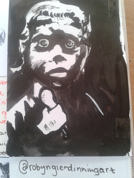
Based off of a Kathe Kollwitz woodcut, zoomed in on a little girl clutching her spoon. brush and ink with a fine liner black pen to tidy up the edges. Kollwitz had the ability to capture the faces and the emotions of the impoverished and downtrodden of Germany without making them mawkish or melodramatic. She drew real people. This probably not the kind of artwork that comes to mind when you mention the 20’s or 30’s. Art Deco was the prominent style of this era. It was profitable and people liked the glitz and glamour of it. But in Germany this Golden Age lasted only a few years ( the golden age of Weimar) in between two horrendous episodes of economic difficulties. the hyperinflation 1923 to 24 during which an estimated 8 million Germans were unemployed. The hyperinflation was rectified by Gustav Stresemann but this economic, cultural and social golden age did not last and was not all that golden. WW1 had left Germany scarred, emotionally and physically. With the overnight collapse of Wall street in 1929, many of the political reforms and treaties made between Germany and the rest of the world were made redundant. Most prevalent were the loans that the USA had given a struggling Germany, which were now swiftly recalled. has the whole of the western world went into economic collapse.

Things did improve in Germany in the inter – war years, but as Kollwitz’s work shows there was a large potion of society left deeply effected by the war and at odds with the government. The many coalition governments that occupied the Reichstag between 1918 to 1933 were interesting to say the lest.

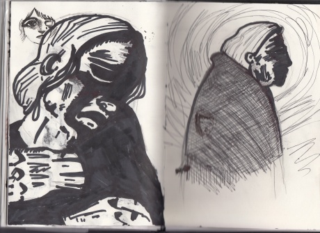
Kathe Kollwitz inspired drawings for my summer project.

Two drawings inspired by two of Kollwitz’s works, the one on the left is a close up of her drawing of a mourning mother/widow, inspired by her own experiences. The one on the right is my version of one of her many self – portraits.

Kollwitz worked primarily in woodcut and lithography. I will be trying my hand at lithography in a couple of weeks. I’ve looked it up and its fairly straightforward just a lot of stages and a lot of washing plates. Woodcut on the other hand is simpler, you get a piece of wood and some shape implements and carve out an image. Which you then ink up and place paper on and repeat and add to as many times as you want to create a more details image. The expressionists favoured woodcut as its difficult and hard going to carve. But this made it more emotive and more expressive. It also worked well with harsh subject matters and really lets the image and its story shine through in simple black and white. Though Kollwitz trained as a painter, most of her work consisted of series of lithographs or woodcuts and pencil and charcoal studies. She also created sculptures. Though after her dismissal from the Prussian academy is lost her large sculpture studio. And was unable the carry on with that avenue of her work.

The Japanese also used woodblock printing. Though some printing techniques may seem tedious they were and are quicker and more reliable than replicating images by hand. Moveable type and printed image are essential to communication design. They make art accessible, affordable and efficient. Mass production of art and text is part of illustration. Prints can be mass produced but they can also be limited edition or single copies giving them infinite value.

Book used for help with this post –  Martin, J. (1993) The Encyclopaedia of  Printmaking Techniques. Quarto Publishing.

More pictures that I did for my summer project

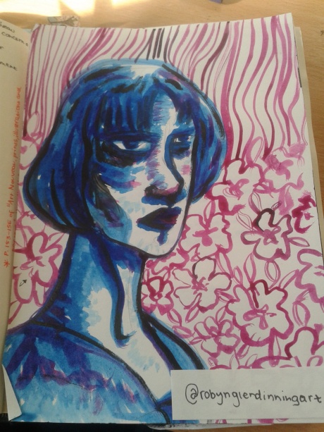
This one is more Emil Nolde inspired than Kollwitz inspired. But like Kollwitz, Nolde is associated with Art Nouveau and German Expression.

2013-10-17 12.48.06

so… blogging hmmm. This is a blog revolving around my communication design context lectures. It’s a project blog. So todays lecture was all about the Origins of Communication, the birth of symbolic language followed by a discussion. I found it really interesting, old pictographic codes and languages. At the beginning of the summer I went to London and went to the Ice Age Art: arrival of the modern mind exhibition at the British Museum. Cave art, like the drawings on the walls of the Chauvet caves in France is really just the beginning of prehistoric art. what really amazed me was a large boar sculpture, it was unusual in its size as most of the other 3D craved objected were small. Whereas this was almost life-size. We will never truly know what compelled early man to make these sculptures and painting. But there is something fascinating about, I especially like the stencilled handprints. they are so eerie and simplistic, a direct link to our ancestors. But are they the signature of those who created the paintings, some right of passage or prehistoric mans version of I was here. As this is a time before written word and in some cases before verbal language.

Even today the true purpose of cave art is unknown, what we know are just theories. Are they functional recording of real life events like a diary or are they symbolic representations of something deeper and less mundane. Or both. Right now my opinion is probably both.

well that’s my first blog post, I think I will go read some books and do some research.

The picture is a postcard I got from the British Museum and here are two links for the British Museum to do with the exhibition Ice age art: the arrival of the modern mind : http://www.britishmuseum.org/whats_on/past_exhibitions/2013/ice_age_art.aspx and http://www.britishmuseum.org/whats_on/past_exhibitions/2013/ice_age_art/about_the_exhibition.aspx

The culture show also did a lovely feature on the exhibition : http://www.bbc.co.uk/programmes/b01qrmpz

Unfortunately the full episode is no longer available but there are still clips.

All of the above links were accessed on the 19.9.2013.