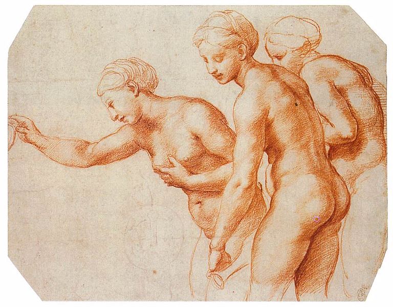
A study in red chalk by Raphael for the Three Graces, 1518. picture from : http://en.wikipedia.org/wiki/File:Raffaello,_studio_per_le_tre_grazie_della_farnesina.jpg
This was not the PRB’s cup of tea at all.
This lecture began with the work of Renaissance artists such as Da Vinci, Raphael and Durer. But went on to go through many artistic movements bringing us up to Modernism. Which will be tackled in some form along with Post – Modernism in my next post. I decided to do a post on the Pre – Raphaelite Brotherhood, which was founded in 1848 by William Holman Hunt, John Everett Millais and Dante Gabriel Rossetti. There was four other members, William Michael Rossetti, James Collinson, Fredric George Stephens and Thomas Woolner. But I am going to focus on Hunt, Rossetti and Millais. The Pre – Raphaelite Brotherhood or PRB’s work was viewed sometimes very harshly by critics (among them Charles Dickens) and the Royal Academy. The PRB rejected the work of Raphael and other Renaissance artists, hence the name, and sought as they put it in the manifesto to :
- “to have genuine ideas to express
- to study nature attentively, so as to know how to express them
- to sympathise with what is direct and serious and heartfelt in previous art, to the exclusion of what is conventional and self-parodying and learned by rote
- most indispensable of all, to produce thoroughly good pictures and statues “
Pre – Raphaelite Brotherhoods manifesto, 1848, from : http://en.wikipedia.org/wiki/Pre-Raphaelite_Brotherhood
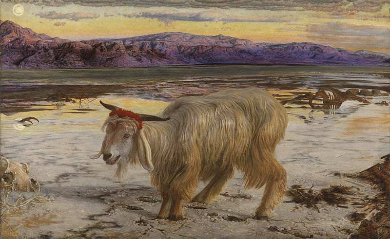
The Scapegoat by William Holman Hunt 1856. picture from : http://en.wikipedia.org/wiki/File:William_Holman_Hunt_-_The_Scapegoat.jpg
The themes that all the painters shared were nature, medieval tales and religion. Hunt painted many religious works, especially after his trip to the Holy land. It was this trip that inspired the painting of “The Scapegoat” in 1856. Prior to this Hunt’s work had been very occupied with nature but still inspired by classic tales and characters such as the fallen woman. He became famous for his religious works whereas his paintings such as “The Hireling Shepard” and “Awakening Conscience” were regarded as inelegant and unsightly. A great attention to detail can be noted in both the work of Hunt and of Millais.
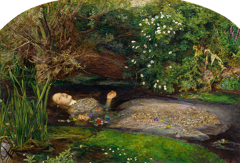
Ophelia by John Everett Millais 1852. picture from : http://en.wikipedia.org/wiki/File:John_Everett_Millais_-_Ophelia_-_Google_Art_Project.jpg
Nature was very important to the PRB and possibly one of the most lush examples of nature can be found in Millais’s “Ophelia” 1852, which depicted the suicide of Ophelia in Shakespeare’s Hamlet. “Ophelia” is one of my favourite paintings, I think I saw it at a very young age and was captivated by the rich flora and the beauty of the model, Elizabeth Siddal, who modelled for the PRB and married Rossetti and was an artist herself. Millais was child prodigy and did gain the patronage of critic John Ruskin. Though this did not last due falling in love with Ruskins wife of five years Effie Ruskin whom was still a virgin. But that’s a story for another day.
Love, sexuality and symbolism was another key theme for PRB, especially Dante Gabriel Rossetti. I find Rossetti’s style quite different from the other members of the brotherhood, Millais in particular whose style is very classical. Rossetti style feels to me to be a precursor of sorts to Art Nouveau. I think its his reoccurring use of beautiful, goddess like women. Of which their were quite a few and many whom he had relationships with. There was Elizabeth Siddal whom he met in 1850 and married in 1860 but she died two years later from a laudanum overdose. Siddal was famous for her near death experience brought on by modelling for Millais’s “Ophelia”. Like most of Rossetti’s muses Siddal had brilliant copper hair and a pale complexion. Rossetti painted her as Beatrice from the story Dante and Beatrice.
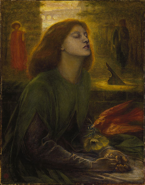
Beata Beatrix by Dante Gabriel Rossetti 1867 – 1870. picture from : http://en.wikipedia.org/wiki/File:Dante_Gabriel_Rossetti_-_Beata_Beatrix,_1864-1870.jpg
http://fascinatinghistory.blogspot.co.uk/2006/01/dante-and-beatrice.html
Rossetti’s other models included Fanny Cornforth, Alexa Wilding, Marie Spartali Stillman, Annie Miller and Jane Morris. Jane Morris was the wife of William Morris the founder of the Arts and Crafts movement. The three were good friends but it could be described as something of a love triangle. Jane Morris shared the other models pale complexion but her hair was raven black. But like Siddal she was one of Rossetti’s great muses and beauties.

Proserpine by Dante Gabriel Rossetti 1874. picture from : http://en.wikipedia.org/wiki/File:Dante_Gabriel_Rossetti_-_Proserpine.JPG
The Pre – Raphaelite Brotherhood were controversial, disliked and avant – garde for their time in the rather stuffy Victorian London. Their lives and loves have been fictionalised many times. Their work was beautiful, naturalistic, religious and for the time just a little bit naughty. The PRB pursued their own kind of realism that was just a tad inventive at times.
References and Links to webpages that helped me write this post :
The Tate gallery. Pre – Raphaelites : Victorian Avant – garde. Available at : http://www.tate.org.uk/whats-on/tate-britain/exhibition/pre-raphaelites-victorian-avant-garde
BBC news article on the selling of Rossetti’s Proserpine. Available at : http://www.bbc.co.uk/news/entertainment-arts-25004793
MASTERS, T. Lizzie Siddal: Victorian model’s tragic story on stage. Available at : http://www.bbc.co.uk/news/entertainment-arts-24803177
Desperate Romantics programme page. Available at : http://www.bbc.co.uk/programmes/b00lvyq2
Wikipedia. The Pre – Raphaelite Brotherhood. Available at : http://en.wikipedia.org/wiki/Pre-Raphaelite_Brotherhood
All of the above links were accessed on the 20.11.2013.


